The choice Element
The choice element provides a number of options, of which the consumer can choose a specifiable amount.
{
    "type": "choice",
    "tags": Array<String>,
    "version": String,
    "key": String,
    "label": ?String,
    "placeholder": ?String,
    "selected": Array<String>,
    "allow_selected": ?{
            "min": ?Integer,
            "max": ?Integer
    },
    "options": Array<{
            "value": String,
            "label": String,
            "description": ?String,
            "badge": ?{
                "type": "image"|"text",
                "content": "String"
            },
            "disabled": Boolean
    }>
}
The placeholder property specifies a short hint that describes the expected value of the choice element.
The selected array holds the values of the selected options which should be selected at initialisation.
The optional allow_selected property specifies how many options must be selected at least and at most.
The values for allow_selected could indicate the styling of the choice element:
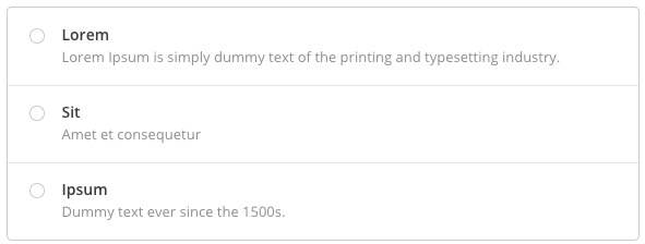
If the consumer has to select exactly one option ({min: 1, max: 1}), this suggests the usage of either a <select> or <radio>s.
An example of how this might look is depicted below:
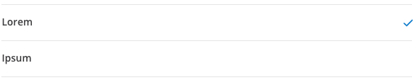
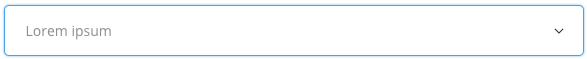
If the consumer does not have to select an option ({min: 0, max: 1}) or can select multiple ({min: >=1, max: >1}), this suggests the usage of either a <select multiple> or <checkbox>es.
An example of how this might look is depicted below:
Please not that a radio, select or checkbox attribute in the tags array could also indicate a suggested way of visualizing the choice element.
The optional min property specifies how many options must be selected at least.
The default value is 1.
The optional max property specifies how many options can be selected at most.
The default value is 1.
The options array contains the available options as objects.
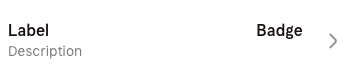
The label property will be shown to the consumer.
The optional property badge - depending on its type property - either holds a text or an image source.
The value of the type property has to be either image or text to indicate the type of badge.
The value of the content property can be a base64-encoded string or a URL.
The optional description property contains text which provides additional information about the option.
The disabled property marks an option as disabled or unclickable.
Possible Values for tags
BOX
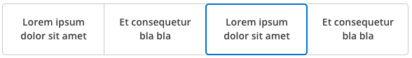
Example of a possible look of a choice element with the
BOXtag.
DROPDOWN
Example of a possible look of a choice element with the
DROPDOWNtag.
RADIOCHECKBOXSELECTHORIZONTAL
Example
{
    "type": "choice",
    "key": "choice",
    "tags": [],
    "version": "1.1.0",
    "label": "",
    "placeholder": "",
    "selected": ["test_value_1"],
    "allow_selected": {
        "min": 1,
        "max": 1
    },
    "options": [
        {
            "value": "test_value_1",
            "label": "example1",
            "description": "First Example",
            "disabled": false
        },
        {
            "value": "test_value_2",
            "label": "example2",
            "disabled": false
        },
        {
            "value": "test_value_3",
            "label": "example3",
            "disabled": true
        }
    ]
}
Returning the value of the choice Element
The value sent back to the server for the choice element has to be an array of strings with the value(s) of the selected option(s).
The following example first depicts the received form and then two possible unencrypted responses to it:
{
    "form_identifier": "ab12c34d-e45f-6789-0a12-3bc4de567fa",
    "version": "1.0.0",
    "elements": [
        {
            "type": "choice",
            "key": "choice1",
            "tags": [],
            "version": "1.1.0",
            "selected": ["0"],
            "allow_selected": {
                "min": 1,
                "max": 2
            },
            "options": [
                {
                    "value": "test_value_1",
                    "label": "example1",
                    "description": "First Example",
                    "disabled": false
                },
                {
                    "value": "test_value_2",
                    "label": "example2",
                    "disabled": false
                },
                {
                    "value": "test_value_3",
                    "label": "example3",
                    "disabled": true
                }
            ]
        }
    ]
}
For one selected option a response could look like this:
{
    "form_identifier": "ab12c34d-e45f-6789-0a12-3bc4de567fa",
    "data": [
        {
            "key": "choice1",
            "value": ["test_value_1"]
        }
    ]
}
For two selected options a response could look like this:
{
    "form_identifier": "ab12c34d-e45f-6789-0a12-3bc4de567fa",
    "data": [
        {
            "key": "choice1",
            "value": ["test_value_1", "test_value_3"]
        }
    ]
}
Changelog
1.1.0 - 13.05.2019
- Added
option.badge - Added
option.description
1.0.0 - 01.02.2019
- initial version