The context Element
The context element is a container which groups elements that have a semantic relationship.
A context would group e.g. a flicker element and the input element in which the consumer needs to input the result of the flicker code interaction.
{
    "type": "context",
    "version": String,
    "tags": Array<String>,
    "content": Array<FormElement>
}
The content property contains an array of form elements.
Possible values for tags
HORIZONTAL
Suggests a horizontal layout instead of the default vertical one.
CAPTCHA

Example of a possible look of the context element with a
CAPTCHA&HORIZONTALtag and twotextelements and animageelement as the content.
MULTIINPUT(deprecated)
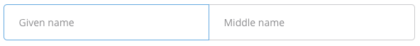
Example of a possible look of the context element with a
MULTIINPUT&HORIZONTALtag and twoinputelements as the content.
BOX_SUCCESS,BOX_INFO,BOX_WARNING,BOX_DANGER
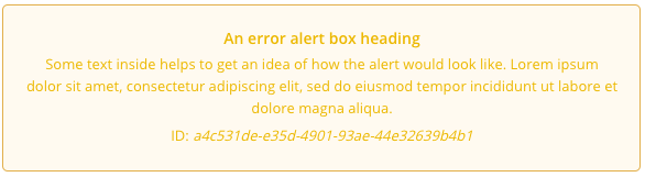
Example of a possible look of a context element with the tag
BOX_WARNINGthat contains atextelement.
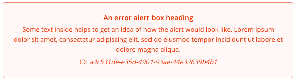
Example of a possible look of a context element with the tag
BOX_DANGERthat contains atextelement.
RADIOSELECT(deprecated)
Example
{
    "type":"context",
    "version":"1.0.0",
    "tags":[],
    "content": [...]
}
Handling possible context variations
Contexts main purpose are to denote a relationship between elements and thus can lead to improved UX if the content is displayed accordingly.
This section will list some known combinations and will advice on how to handle them.
Note that this is just advice on how we handle such combinations in the Klarna Branded integrations and depending on your product, brand and UX your implementation might need other adjustments.
Input with Helptext
One common combination is an input with additional information regarding the data which it should contain.
This normally is denoted by a context wrapping a pair of input and a text with tag HELPTEXT.
Example
{
    "type": "context",
    "version": "1.0.0",
    "tags": [],
    "content": [
        {
        "key": "USER_PIN",
        "type": "input",
        "version": "1.0.0",
        "tags": [],
        "password": true,
        "label": "PIN",
        "read_only": false,
        "validator": {}
        },
        {
        "content": "The PIN of your online banking",
        "type": "text",
        "version": "1.0.0",
        "tags": [
            "HELPTEXT"
        ]
        }
    ]
}
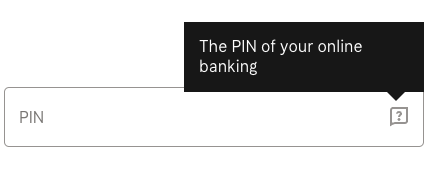
Note that the order of text and input does not matter.
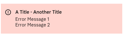
Boxes
To emphasize important information our api can tag a context element with one of four BOX-tags:
BOX_SUCCESSBOX_INFOBOX_WARNINGBOX_DANGER
On top of the display visible above our Klarna Branded solution also supports adding a title to the box, when the context contains at least one text with the tag TITLE.
Multiple text-elements with TITLE-tag ´get concatenated.
Example
{
    "type": "context",
    "version": "1.0.0",
    "tags": [
        "BOX_DANGER"
    ],
    "content": [
        {
        "content": "A Title",
        "type": "text",
        "version": "1.0.0",
        "tags": [
            "TITLE"
        ]
        },
        {
        "content": "Another Title",
        "type": "text",
        "version": "1.0.0",
        "tags": [
            "TITLE"
        ]
        },
        {
        "content": "Error Message 1",
        "type": "text",
        "version": "1.0.0",
        "tags": []
        },
        {
        "content": "Error Message 2",
        "type": "text",
        "version": "1.0.0",
        "tags": []
        }
    ]
}
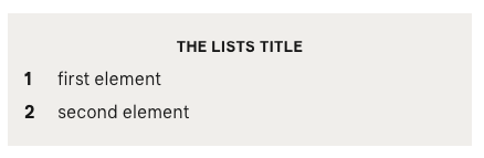
Lists with titles
Additionally to the box with a title mentioned above we also display text with TITLE-tag differently if they are part of a context containing a text with a LIST-tag.
Example
{
    "type": "context",
    "tags": [],
    "version": "1.0.0",
    "content": [
        {
        "content": "The Lists title",
        "type": "text",
        "version": "1.0.0",
        "tags": [
            "TITLE"
        ]
        },
        {
        "content": "<ol><li>first element</li><li>second element</li></ol>",
        "type": "text",
        "version": "1.0.0",
        "tags": [
            "LIST"
        ]
        }
    ]
}
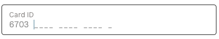
Combined Inputs
In specific situations we try to combine multiple input-elements into a single input field if surrounding context allows it.
To support such UX the context.content must comply with following rules:
- The first element must be a
text-element with aTITLE-tag, which can be used as the resulting inputs label Must contain a
contextwithMULTIINPUTandHORIZONTAL-tag, where thiscontext.contentmust comply with:- Must contain only
input-elements - Each
inputelement must have thepassword-property set tofalse - Each
input-element must either berequiredand of fixed length (min_lengthequalsmax_length) orread_only
- Must contain only
Can contain a
textwithHELPTEXT-tag that will be applied to the resulting singleinputas described here
Example
{
    "type": "context",
    "tags": [],
    "version": "1.0.0",
    "content": [
        {
        "content": "Card ID",
        "type": "text",
        "tags": [
            "TITLE"
        ],
        "version": "1.0.0"
        },
        {
        "content": [
            {
            "key": "LOGINNAME__CARDPART_FIX",
            "type": "input",
            "tags": [],
            "version": "1.0.0",
            "password": false,
            "prefill_value": "6703",
            "read_only": true,
            "validator": {
                "min_length": 4,
                "max_length": 4
            }
            },
            {
            "key": "LOGINNAME__cardid2",
            "type": "input",
            "tags": [],
            "version": "1.0.0",
            "password": false,
            "read_only": false,
            "validator": {
                "min_length": 4,
                "max_length": 4
            }
            },
            {
            "key": "LOGINNAME__cardid3",
            "type": "input",
            "tags": [],
            "version": "1.0.0",
            "password": false,
            "read_only": false,
            "validator": {
                "min_length": 4,
                "max_length": 4
            }
            },
            {
            "key": "LOGINNAME__cardid4",
            "type": "input",
            "tags": [],
            "version": "1.0.0",
            "password": false,
            "read_only": false,
            "validator": {
                "min_length": 4,
                "max_length": 4
            }
            },
            {
            "key": "LOGINNAME__cardid5",
            "type": "input",
            "tags": [],
            "version": "1.0.0",
            "password": false,
            "read_only": false,
            "validator": {
                "min_length": 1,
                "max_length": 1
            }
            }
        ],
        "type": "context",
        "tags": [
            "MULTIINPUT",
            "HORIZONTAL"
        ],
        "version": "1.0.0"
        }
    ]
}
Changelog
1.0.0 - 01.02.2019
- initial version