The switchable Element
The switchable element allows to switch between different options (groups of XS2A Form elements) that are provided in the options property.
{
    "type": "switchable",
    "tags": Array<String>,
    "version": String,
    "key": String,
    "selected": String,
    "options": Array<{
        "value": String,
        "label": String,
        "content": Array<FormElement>,
        "disabled": Boolean,
        "description": ?String,
        "badge": ?{
            "type": Enum<'image', 'text'>,
            "content": String
        },
    }>,
    "validator": ?{
        "required": ?Boolean
    }
}
The selected property sets the initial state of the element.
At any time only one option (a group of elements) can be active.
The options array contains the available XS2A Form element groups as objects.
The value property acts as an identifier for the option.
The label property holds a label can be shown to the consumer.
The content array holds the group of form elements to be shown to the consumer if the option is selected.
The disabled property that marks an option as disabled or unclickable
The optional description property contains text which provides additional information about the option.
The optional property badge - depending on its type property - either holds a text or an image source.
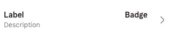
The value of the type property has to be either image or text to indicate the type of badge.
The value of the content property can be a base64-encoded string or a URL.
The validator property may contain the required rule for the switchable element to be validated against.
All form elements that are part of an inactive option, hence part of a group that is not the one that is currently selected, must not be validated since these values are not submitted.
If the required property is set to true, then the switchable element's value cannot be empty in order to be valid. It has to contain the value property of one of the options.
Possible values for tags
COLLAPSIBLE
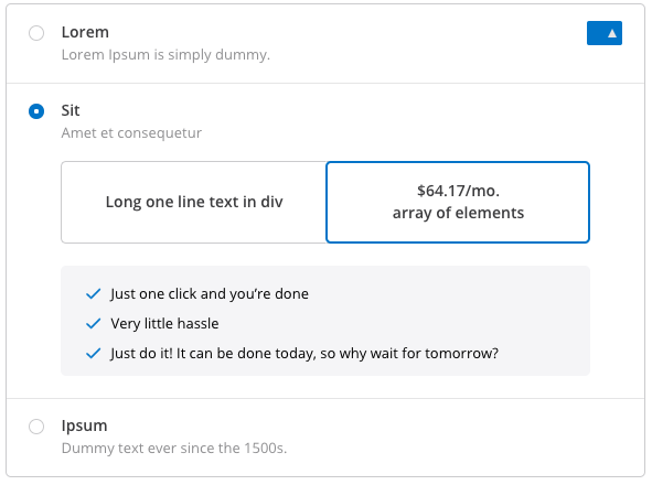
Example of a possible look of a switchable element with the
COLLAPSIBLEtag and an inner form.
TABS

Example of a possible look of a switchable element with the
TABStag.
DROPDOWN
Example
{
    "type": "switchable",
    "key": "switchable",
    "tags": [],
    "version": "1.1.0",
    "selected": "test_form_1",
    "options": [
        {
            "value": "test_form_1",
            "label": "Form1",
            "content": [...],
            "description": "First form",
            "disabled":false
        },{
            "value": "test_form_2",
            "label": "Form2",
            "content": [...],
            "disabled":true
        },{
            "value": "test_form_3",
            "label": "Form3",
            "content": [...],
            "disabled": false
        }
    ]
}
Returning the value of the switchable Element
The value sent back to the server for the switchable element has to be the value of the chosen option.
Additionally only the keys and values of the chosen option's elements have to be returned.
This is especially important since we cannot guarantee unique keys between the different groups of form elements in the options array.
The following example first depicts the received form and then the unencrypted response to it:
{
    "form_identifier": "ab12c34d-e45f-6789-0a12-3bc4de567fa",
    "version": "1.0.0",
    "elements": [
        {
            "type": "switchable",
            "key": "switchable1",
            "tags": [],
            "version": "1.1.0",
            "selected": "test_form_1",
            "options": [
                {
                    "value": "test_form_1",
                    "label": "Form1",
                    "content": [
                        {
                            "type": "input",
                            "key": "input0",
                            "version": "1.0.0",
                            "tags": [],
                            "password": false,
                            "label": "Login",
                            "read_only": false
                        }
                    ],
                    "description": "First form",
                    "disabled": false
                },{
                    "value": "test_form_2",
                    "label": "Form2",
                    "content": [
                        {
                            "type": "input",
                            "key": "input1",
                            "version": "1.0.0",
                            "tags": [],
                            "password": false,
                            "label": "E-Mail",
                            "read_only": false
                        }
                    ],
                    "description": "Second form",
                    "disabled": false
                }
            ]
        }
    ]
}
This example response depicts the case in which the input field of the second form was filled:
{
    "form_identifier": "ab12c34d-e45f-6789-0a12-3bc4de567fa",
    "data": [
        {
            "key": "switchable1",
            "value": "test_form_2"
        },
        {
            "key": "input1",
            "value": "john@doe.com"
        }
    ]
}
Changelog
1.1.0 - 13.05.2019
- Added
option.badge - Added
option.description
1.0.0 - 01.02.2019
- initial version