The toggle Element
The toggle element defines a single element which can be set to either on or off.
{
    "type": "toggle",
    "tags": Array<String>,
    "version": String,
    "key": String,
    "label": String,
    "selected": Boolean,
    "validator": ?{
        "required": ?Boolean
    }
}
The label property represents a caption for the toggle element.
The selected property sets the initial state of the toggle element.
The validator property may contain the required rule for the toggle element to be validated against.
If required is set to true, then the toggle element's value also has to be true to be valid.
Possible values for tags
ACCEPT
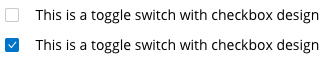
Example of a possible look of a toggle element with the
ACCEPTtag.
SETTINGS
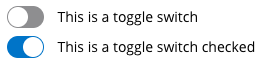
Example of a possible look of a toggle element with the
SETTINGStag.
Example
{
    "type": "toggle",
    "tags": [
        "ACCEPT"
    ],
    "key": "toggle1",
    "version": "1.0.0",
    "label": "Accept",
    "selected": false
}
Returning the value of the toggle Element
The value sent back to the server for the toggle element has to be either true or false.
It cannot be empty.
The following example first depicts the received form and then the unencrypted response to it:
{
    "form_identifier": "ab12c34d-e45f-6789-0a12-3bc4de567fa",
    "version": "1.0.0",
    "elements": [
        {
            "type": "toggle",
            "tags": ["ACCEPT"],
            "key": "toggle1",
            "version": "1.0.0",
            "label": "Accept",
            "selected": false
        }
    ]
}
{
    "form_identifier": "ab12c34d-e45f-6789-0a12-3bc4de567fa",
    "data": [
        {
            "key": "toggle1",
            "value": true
        }
    ]
}
Changelog
1.0.0 - 01.02.2019
- initial version